Gradient background colors inconsistent in Usage Report tabs
2 posts · Closed
Chris Guest
When using a gradient background for the desktop graph such as this, with a very dark lower section and medium-dark upper section:
[image: https://i.ibb.co/Tm3RPkC/Image-1.png]

Hourly Rates tab shows the correct colours:
[image: https://i.ibb.co/QPvrVZk/Image-2.png]

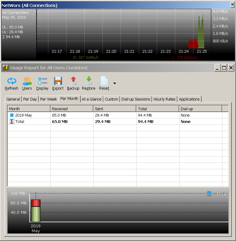
But Usage Report tabs show a light lower section, which makes the text (when using a light text colour to contrast the dark background) hard to read:
[image: https://i.ibb.co/pb8S3hg/Image-3.png]

My setup: Windows 10 x64 V1903; NetWorx 6.2.4 64-bit
Andrew SoftPerfect
Thank you for pointing this issue out. We've just fixed it and you are welcome to download and try the new build.
It should now all be consistent:
This topic is closed.
It has had no new posts for over a year, so the software versions it talks about may be out of date.
Start a new topic in NetWorx if you have a similar question.