Line spacing in the latest revision seems off
4 posts
Hi,
Is it correct that the line spacing in the latest revision seems off? The result list is much longer than in the old version and takes up unnecessary space. I checked the font setting: the font is the same as before. Do I miss something? (Portable version 25.12)
Thanks and regards,
B.
It really depends on someone's personal definition of "off". ;-)
You are not missing anything, except the mention in the changelog that the interface was made more legible. This includes increased line spacing, and was meant to make distinguishing of lines easier. Of course this also makes the list a bit longer, and may require another touch of the mouse wheel to scroll through it.
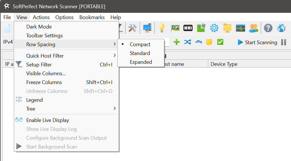
We thought the increased legibility would be welcome. But if it turns out to be a problem for some users, we will consider adding a setting for switching to a more compact display.
Hi,
Thank you for your reply.
Getting it back with a setting would be great :-). In Windows, the first thing I enable in Explorer is "Compact view" which is somewhat similar.
Regards
B.